Admissions intelligence,
for the whole school.
Six live KPI cards. Evalent-generated grade signals. An executive report your board can act on. All powered by data your team already has.
Watch this 90-second walkthrough
Know where every grade stands, without a spreadsheet
Most schools manage enrolment across a patchwork of spreadsheets, emails, and meeting notes. Evalent replaces that with a single live view of every grade: how full it is, who is leaving, who has confirmed they are returning, and how many new students are in the pipeline.
Six KPI cards update automatically as your admissions data changes. Evalent-generated signals surface the grades that need attention. And when it is time to report to your board, one click generates a professional executive summary written in the language of your school.
See it in action
Click any grade pill to see how the six KPI cards update instantly, just like the real Strategy page in your school account.
127 seats still needed
188 staying · 71 undecided · 58 leaving
23 more in process · 13 rejected
Save plan to start tracking trend
Net movement: -36 (22 in – 58 out)
7% of target in active consideration
Live data from your school, updated automatically · Click any grade pill to change the view
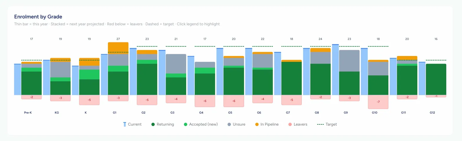
Every grade. One view.
The Enrolment by Grade chart shows your whole school on a single canvas. Current year as a thin blue bar, next year projected as a stacked column, leavers below the baseline, and your target as a dashed line. Seven legend items are individually clickable, fading everything else to reveal the signal you're looking for.